Learn how to create dynamic charts in Excel with comprehensive guide. Enhance your data visualization skills today
What you will learn
Use Form Controls & Pivot Table (dropdown list, radio button, spin button, checkbox, scroll bar, slicer, etc.) to create interactive charts & graphs.
Use advanced Excel formulas and functions to generate custom data visualization.
Format and customize charts to make meaningful and impactful visuals.
Build stunning, professional-looking data presentation with Excel demo-exercises.
Understand how to interpret and present data using a variety of chart types.
Explore how to use data visualizations to make decisions.
Description
When a chart is dynamic, it is easier to understand the data and can help to identify trends more quickly. Dynamic charts can also save time by eliminating the need to manually update the chart or graph.
In Microsoft Excel, you can create a chart that automatically updates as changes are made to the data or series of the chart. This makes it convenient to work with large data sets and quickly create charts that can be used to display data in a visually appealing way.
This course on Data Visualization-Dynamic Excel Charts & Graphs [Part-2] is designed to help you become an expert in creating dynamic and meaningful charts and graphs in Microsoft Excel.
You will learn to use Excel interactive FORM CONTROLS & PivotTable to create effective data visualization and storytelling, as well as techniques for data manipulation and analysis.
You will also learn how to generate dynamic charts and graphs that can be used to present data in a compelling and visual way. Additionally, you will learn how to use various techniques and tools to effectively present data in an interactive and engaging format.
Topic covered include:
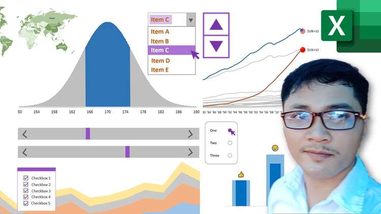
- Dynamic Chart with Dropdown List
- Visual Selecting Chart with Radio Button
- Multiple Selecting Chart with Checkboxes
- Animating Change Over Time Chart with Spin Button
- Range of Values Chart with Scroll Bars
And more…
By the end of the course, you will have the skills and tools necessary to create dynamic charts and graphs in Excel that will help you better understand and communicate data.
Well, let’s get started!
Datariel (Analytics training center)
Content