• Post category:StudyBullet-14
  • Reading time:7 mins read


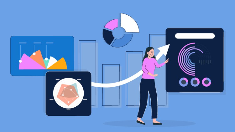
Transforming Data into Insights: A Comprehensive Guide to Python-based Data Visualization

What you will learn

Understanding the importance of data visualization, its role in data analysis, and the principles of effective visualization design.

Exploring popular Python libraries such as Matplotlib, and Seaborn, and learning how to leverage their functionalities to create a variety of visualizations.

Understanding how to customize and enhance visualizations by adjusting colors, labels, titles, legends, and other visual elements.

Understanding the principles of effective data storytelling and best practices for designing clear, impactful, and informative data visualizations.

Description

Use Python to build spectacular data visualisations and fascinate your audience. Join our transformative masterclass to master Python for data visualisation.

Visual storytelling is crucial in a data-driven environment. This comprehensive Python course will teach you how to turn raw data into stunning visualisations.

You’ll learn how to maximise Matplotlib, Seaborn, and Plotly via immersive hands-on activities and real-world examples. Python opens us a universe of data visualisation possibilities, from simple charts to heatmaps, time series visualisation, and geospatial mapping.


Get Instant Notification of New Courses on our Telegram channel.


As you master every component of your visualisations, you may customise them to create stunning masterpieces that fascinate and engage your audience. Interactive dashboards will let people explore data and discover hidden insights.

This masterclass will teach data analysts, corporate leaders, researchers, and aspiring data enthusiasts how to use the most popular data visualisation programming language to have a lasting effect. Practical projects, real-world case studies, and industry experts will give you the confidence and skills to tackle any Python data visualisation challenge.

Avoid boring presentations that don’t tell your data’s story. Join us to use Python to visualise difficult data in beautiful, persuasive ways. Become a Python data visualisation expert and boost your career. Enrol today and unleash your creativity with Python.

English
language

Content

Setup & Installation

Installing the Anaconda Navigator
Installing Matplotlib, seaborn & cufflinks
Reading data from a csv file with pandas
Explaining Matplotlib libraries

Plotting Line Plots with matplotlib

Changing the axis scales
Label Styling
Adding a legend
Adding a grid to the chart
Filling only a specific area
Filling area on line plots and filling only specific area
Changing fill color of different areas (negative vs positive for example)

Plotting Histograms & Bar Charts with matplotlib

Changing edge color and adding shadow on the edge
Adding legends, titles, location and rotating pie chart
Histograms vs Bar charts (Part 1)
Histograms vs Bar charts (Part 2)
Changing edge color of the histogram
Changing the axis scale to log scale
Adding median to histogram
Advanced Histograms and Patches (Part 1)
Advanced Histograms and Patches (Part 2)
Overlaying bar plots on top of each other (Part 1)
Overlaying bar plots on top of each other (Part 2)
Creating Box and Whisker Plots

Plotting Stack Plots & Stem Plots

Plotting a basic stack plot
Plotting a stem plot
Plotting a stack plot od data with constant total

Plotting Scatter Plots with matplotlib

Plotting a basic scatter plot
Changing the size of the dots
Changing colors of markers
Adding edges to dots

Time Series Data Visualization with matplotlib

Using the Python datetime module
Connecting data points by line
Converting string dates using the .to_datetime() pandas method
Plotting live data using FuncAnimation in matplotlib

Creating multiple subplots

Setting up the number of rows and columns
Plotting multiple plots in one figure
Getting separate figures
Saving figures to your computer

Plotting charts using seaborn

Introduction to seaborn
Working on hue, style and size in seaborn
Subplots using seaborn
Line plots
Cat plots
Jointplot, pair plot and regression plot
Controlling Plotted Figure Aesthetics

Plotly and Cufflinks

Installation and Setup
Line, Scatter, Bar, box and area plot
3D plots, spread plot and hist plot, bubble plot, and heatmap