Race Bar Charts, 3D Maps, Globe Connections, Parliament Chart, Word Cloud, Network Graph, Survey Chart, Photo Slider etc
What you will learn
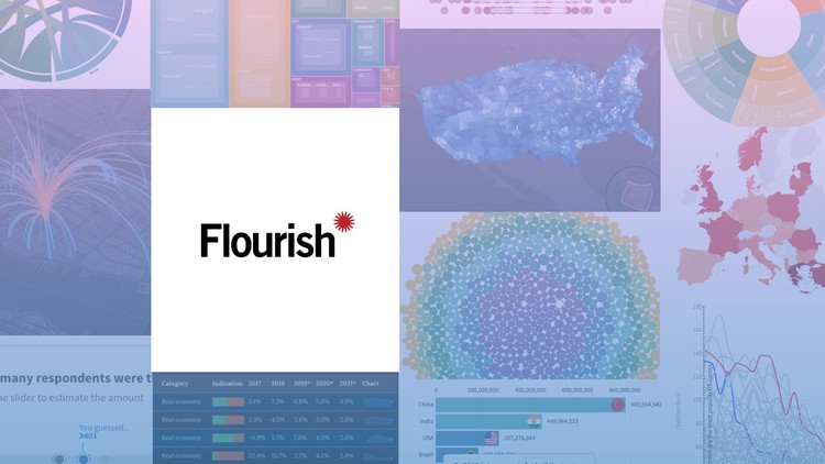
Know about Flourish Studio as an Enterprise Level BI tool
How to use Flourish Studio to create Interactive and Beautiful Dashboards
How to connect Data sets with Live Examples
All the Chart Types in Google Data Studio like Bar, Line, Geo Maps, Scatter Plots, Animated Charts etc and how to configure each of them
Embedding your report in your Website with Live Example.
How to Merge data from different Tables to bring together to create one report
Best Chart Practices to create useful, interactive, feature-rich and beautiful Reports.
Best resources to get Datasets to get started
Guide to select the most appropriate chart basis your data and requirement.
Description
Data visualization brings more eyes, attention and understanding to complex stories. When it works well, it can make a story crystal-clear. Through an online BI tool called Flourish Studio, you can design and create interactive, attractive, mobile friendly graphics to embed on a website or export as a SVG file, without needing to code at all. Well, To be frank, Flourish tops the list when it comes to storytelling. Other than the conventional methods of visualizing your data as charts, maps, and dashboards it turns your data into interactive stories.
It produces a wide array of both static and dynamic visualizations, including scatter plots, basic charts, projection maps, network graphs, bar chart races, and more.
With Flourish, people with no coding experience can make high-end interactive graphics and stories with no tech support required. Infact, if during the tough times of Covid, you have seen animated bar charts that dynamically updated the case count day by day, then let me tell you, most of them were created using Flourish Studio ! And in this course you will learn how easy it was to create those charts, and how to create a similar one from your data !
This course overviews the complete in and out of working with Flourish Studio. We begin with introducing Flourish to you, and then look at the interface and features. We learn how to setup our data & then we move on to the most exciting part – creating charts. We cover most of the available chart types one by one and see how we can configure them to suit our needs. We talk about Stories, narrations, and also embedding these charts in our web applications.
Top Reasons why you should learn Flourish Studio :
- Flourish Studio is the #1 cloud based Business Intelligence tool used industry wide for Data Journalism.
- The demand for BI professionals is on the rise. This is one of the most sought-after profession currently in the lines of Data Science.
- There are multiple opportunities across the Globe for everyone with this skill.
- Flourish Studio has a small learning curve and you can pick up even advanced concepts very quickly.
- You do not need high configuration computer to learn this BI tool. All you need is any system with internet connectivity.
Most Importantly, Guidance is offered beyond the Tool – You will not only learn the Software, but important Dashboard Design principles. Also, I will share a cheat sheet to quickly find the right chart to use, sources to get public datasets to work on, Getting inspirational ideas, and more ..
A Verifiable Certificate of Completion is presented to all students who undertake this Flourish Studio course.
Content
- Course Overview
- Interactive Data Storytelling: This masterclass shifts the focus from static reporting to dynamic narrative construction, teaching you how to guide an audience through complex data layers using motion and interactivity.
- No-Code Visual Sophistication: Explore the intersection of design and data science by leveraging high-level tools that eliminate the need for manual programming while maintaining professional-grade output.
- Visual Communication Logic: Learn why certain animations work better for specific datasets, ensuring that your visualizations are not just “flashy” but also cognitively effective for the viewer.
- Real-World Application: Focus on creating production-ready assets suitable for digital journalism, corporate executive summaries, and high-impact social media content.
- Requirements / Prerequisites
- Foundational Data Literacy: A basic understanding of how data is organized in rows and columns (CSV or Excel formats) is recommended to get the most out of the technical mapping sections.
- Hardware and Software: Access to a standard desktop or laptop with a modern web browser; no high-end GPU or specialized software installation is required as the platform is cloud-based.
- Creative Curiosity: A willingness to experiment with different visual metaphors and an interest in aesthetic design principles.
- Skills Covered / Tools Used
- Data Schema Optimization: Mastering the art of “reshaping” your spreadsheets to fit the specific requirements of various animation engines within the Flourish environment.
- Geo-Spatial Mapping Logic: Developing the skills to handle latitude/longitude coordinates and GeoJSON files for creating immersive 3D environments and global connection flows.
- Visual Hierarchy and Brand Alignment: Learning to customize CSS-based styling, typography, and color palettes to ensure visualizations match specific brand guidelines or publication styles.
- Interaction Design: Configuring advanced pop-up panels, custom filters, and multi-step “story” modes that allow users to drill down into specific data points.
- Deployment and Integration: Best practices for embedding visualizations into CMS platforms like WordPress, sharing via iframe, or exporting high-resolution assets for video production.
- Benefits / Outcomes
- Rapid Prototyping Capabilities: Gain the ability to turn a raw dataset into a fully functional, interactive visualization in a fraction of the time it would take using traditional coding libraries.
- Competitive Edge in Data Literacy: Position yourself as a modern communicator who can bridge the gap between dry statistics and engaging, visual-first storytelling.
- Enhanced Audience Retention: Utilize the “scrollytelling” features and animated transitions to keep users engaged with your content longer than static images ever could.
- Versatile Portfolio Pieces: Walk away with a diverse collection of interactive charts and maps that demonstrate your ability to handle various data types and communication challenges.
- PROS
- High Accessibility: Makes complex data visualization techniques available to designers and analysts who do not have a background in D3.js or Javascript.
- Seamless Updates: Since the visualizations are hosted, any changes made to the underlying data can be pushed live instantly without re-embedding.
- Responsive by Default: Templates are engineered to automatically adjust for mobile, tablet, and desktop views, ensuring a consistent user experience.
- CONS
- Platform Dependency: Because the course is built around a specific ecosystem, users are limited to the customization options provided by the platform’s internal architecture and may face challenges when attempting to build entirely unique, non-template-based visual structures.