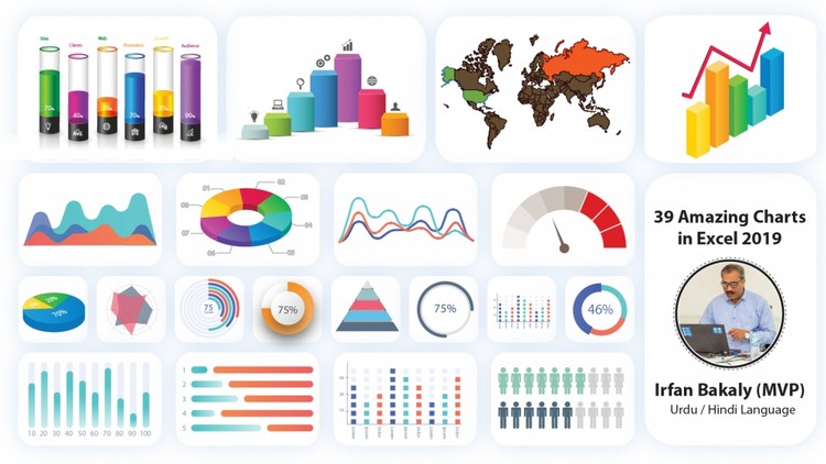
Gain Highly Advanced Excel Skills to Create Impressive Excel Graphs for your Management Reports (Excel 2019)
What you will learn
Significantly improve your Excel reports to create more powerful graphs that communicate your information in the best manner
Impress your management by including new Excel graphs in your reports (such as my Pin chart for variances)
Apply Best Practice methods to considerably improve the design of your Excel charts and tables
Learn creative & simple techniques that allow you to create your own Excel charts from scratch
Become the Excel data Visualization star in your department by creating impressive Excel charts and graphs in your reports
Description
Without Doubt, With This Advanced Microsoft Excel Chart Course, You will be the Excel data Visualization star in your Department!
Significantly Improve your Reports by using Advanced Excel Graph Techniques.
This Course Includes:
- Downloadable Workbook to follow the demonstrations (and use the charts as your templates).
- Downloadable Exercise Book (answers included).
If you use Excel to generate reports and graphs, my hands-on Excel training provides you with an extremely advanced toolkit worth of knowledge that will take the design of your Excel charts, tables and reports to the next level. It will provide you with the best tricks to create dynamic charts. It will save you tons of time of manually updating your Excel graphs on a monthly basis. The visualization techniques introduce you to some unusual methods to handle and create charts which will enhance readability of your reports as well as impress your readers.
Note: This course is design in Hindi / Urdu language.
Content