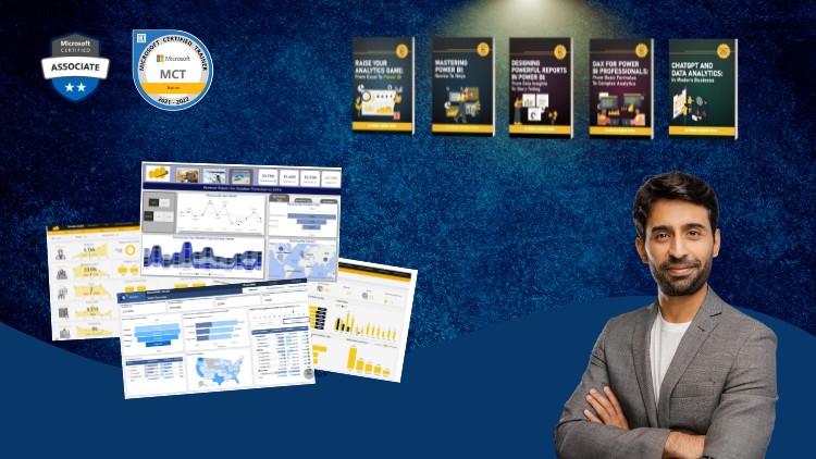
A Full Guide to Creating Insightful Reports, Interactive Dashboards, and Effective Data Storytelling Using Power BI
What you will learn
Design professional-quality reports in Power BI that are both visually appealing and easy to navigate.
Create interactive dashboards that allow users to explore data and gain insights dynamically.
Explore advanced Power BI features such as bookmarks, drill-throughs, and report tooltips to enhance report interactivity.
Implement themes and templates to ensure consistency across reports and align with organizational branding.
Use Power BI’s various visualization options to represent data effectively, including charts, maps, and custom visuals.
Become an expert in using Power BI to analyze and visualize numbers
Why take this course?
Based on the comprehensive outline you’ve provided for a Power BI reporting course, here are some additional tips and best practices for each module to enhance the learning experience and ensure the reports created are both functional and visually appealing:
Module 4: Donut & Column Charts
- When creating donut charts, ensure there is a clear differentiator between each data segment to maintain readability.
- For column charts, consider the order of the columns to represent categorical data in a meaningful way (e.g., chronological or importance).
Module 5: Selection Pane, Bookmarks, and Buttons
- Use the selection pane to declutter your report canvas by hiding visuals that are not currently in use.
- When creating bookmarks, be mindful of the visual sequence and transitions to guide users through the report smoothly.
- Design buttons with clear labels and icons to improve user experience and accessibility.
Module 6: Switching Visuals through Buttons
- Test different visualizations for the alternative states of your buttons to ensure they provide valuable comparisons or insights.
- Use parameter tables to allow users to select multiple items when switching between visuals.
Module 7: Layering, Grouping, and KPI Cards
- When layering visuals, consider the reading order and how it affects the narrative of your report.
- Group related visuals together to help users understand they are connected.
- KPI cards should be designed to stand out but not overpower other report elements. Use whitespace effectively around them.
Module 8: Chiclet Slicer and Dynamic Titles
- Chiclet slicers are great for mobile reporting as they provide a compact way for users to filter data.
- For dynamic titles, ensure that the DAX formulas used are both efficient and scalable to handle potential future dataset growth.
Module 9: Adding Logos, Slicers, and Finalizing Visuals
- Align your report’s visual design with your organization’s brand guidelines for consistency and professionalism.
- Ensure that logos or any other images are high resolution and appropriately sized to avoid pixelation.
Module 10: Conditional Formatting and Themes
- Use conditional formatting sparingly to highlight important data without causing distraction.
- Consistent themes can help in branding the report and making it easier for users to recognize reports from your organization.
Module 11: Dynamic Calculations
- Validate your DAX formulas with sample data to ensure they work as expected across various scenarios.
- Test the performance of your dynamic calculations, especially if dealing with large datasets, to avoid slow report load times.
Module 12: Dynamic Titles and Tooltips
- Customize tooltips to provide additional context or explanations without overwhelming the user with too much information.
- Ensure that dynamic titles reflect the most relevant data point or summary as the report is interacted with.
Module 13: Reset Button, Exporting, and Importing Themes
- A reset button should revert all visuals and filters back to a default state without causing confusion.
- When exporting and importing themes, document any customizations or considerations that may not be included in the theme files.
Module 14: Drill Throughs
- Design drill-through reports with a similar layout and style to the main report for consistency.
- Provide clear instructions on how to navigate between the initial view and the detailed views to avoid user confusion.
Throughout the course, encourage users to practice by building their own reports using sample datasets provided in Power BI or other data sources they are familiar with. This hands-on experience will solidify their understanding of the concepts and best practices covered in each module. Additionally, consider including case studies or real-world examples that demonstrate how these techniques can be applied effectively in different business scenarios.
Alright, let’s talk about ‘Mastering Power BI Report Design – Beginner to Advanced.’ As someone who’s spent a fair bit of time wrestling with data and trying to make it speak, I’ve seen my share of Power BI reports – the good, the bad, and the utterly baffling. This course really caught my eye because it promised to bridge that gap between knowing how to build a report and knowing how to design one effectively. And honestly, it largely delivers.
Overview
Forget just dragging and dropping visuals onto a canvas; this course is about turning raw data into compelling narratives. It’s not just another “how-to” guide for Power BI features; it’s a deep dive into the art and science of data presentation. We’re talking about understanding user experience (UX) principles, visual psychology, and the critical thinking required to make a report not just functional, but genuinely insightful and actionable. The ‘beginner to advanced’ moniker isn’t just marketing fluff here; it genuinely caters to different levels, starting with foundational design concepts and escalating to sophisticated techniques for interactive dashboards. What impressed me most was the emphasis on how a well-designed report can actually influence decision-making – it’s about impact, not just display. This course helps you go beyond simply showing numbers to actually telling a story with them, ensuring your audience grasps the insights without drowning in data points.
Prerequisites
While the course states ‘beginner to advanced’ for *report design*, let’s be clear: you shouldn’t be a complete Power BI virgin walking in. You’ll get the most out of this if you have a foundational understanding of Power BI Desktop. That means you should be comfortable with importing data, performing basic data transformations in Power Query, and ideally, have a rudimentary grasp of DAX (Data Analysis Expressions) for creating simple measures. If you’re still figuring out what a fact table is, you might want to spend a day or two with a basic Power BI intro first. This isn’t a course on data modeling, it’s about making that data look phenomenal and function flawlessly once it’s modeled. Think of it as a masterclass in interior design after you’ve already built the house’s structure.
Skills & Tools
By the end of this course, you’re not just going to be proficient with Power BI features; you’ll be armed with a robust toolkit of design principles. You’ll learn how to apply classic data visualization best practices, understand the nuances of report navigation and user interface (UI) design within Power BI, and master effective data storytelling techniques. On the tools front, naturally, Power BI Desktop is your primary playground, but you’ll also get a deeper understanding of how the Power BI Service enhances report consumption and interaction. We’re talking about leveraging advanced features like bookmarks, drill-throughs, and custom tooltips to create truly dynamic and interactive dashboards. The focus isn’t just on *what* visuals to use, but *when* and *why* – making you an expert in using these industry-standard tools to analyze and visualize numbers with purpose.
Career Benefits & Job Roles
In today’s data-driven world, merely pulling data isn’t enough; presenting it effectively is paramount. This course significantly boosts your job-ready skills by refining your ability to craft visually compelling and highly functional reports. For individuals looking for substantial career growth, mastering report design is a huge differentiator. It positions you to drive more impactful data-driven decisions within any organization. This skill set is invaluable for roles such as Business Intelligence Analyst, Data Analyst, Data Visualization Specialist, BI Developer, and even management consultants who need to convey complex insights clearly. Furthermore, the systematic approach to report building and design best practices provides excellent groundwork for the reporting and visualization sections of certification prep for exams like Microsoft’s PL-300 (Power BI Data Analyst Associate), making you a more rounded and certified professional. It’s about moving beyond just technical proficiency to becoming a true data communication specialist.
Pros
- Comprehensive Design Focus: This isn’t just a feature-tour. It genuinely delves into design theory, UX principles, and how to apply them within Power BI. It teaches you to think like a designer, not just a developer.
- Highly Practical with Real-World Relevance: The course is packed with hands-on labs and prompts for real-world projects. You’re not just watching; you’re doing. This practical application ensures you build a portfolio of impactful reports.
- Emphasis on Data Storytelling: Moving beyond just charts and graphs, the course teaches you how to structure reports to tell a clear, concise, and persuasive story, which is crucial for gaining buy-in and driving action.
- Advanced Interactivity Techniques: It covers sophisticated features like bookmarks for dynamic navigation, drill-throughs for deeper dives, and effective use of report tooltips, elevating your reports from static displays to engaging data exploration tools.
Cons
- Pacing for Absolute Beginners: While it claims ‘beginner to advanced,’ if your exposure to Power BI is minimal and your design eye is completely untrained, the initial pace might feel a bit fast. It does a great job teaching design, but it assumes you can keep up with the technical aspects of Power BI itself. A strong foundation in basic Power BI functionality will prevent you from feeling overwhelmed in the earlier modules.