Watch me first
Start watching me first
How to use the practice files
How to Create Dashboard that Updates Dynamically
Getting Icons for your Projects
How to Pick Colors for your Projects
Update broken links
How to Handle Errors in Power Query before you Start
What Excel Understands
Week 1 Personal Expenses Dashboard
Dashboard Introduction
Data Cleaning and Transformations
Creating Dashboard Layout
Expenses Flows
Creating Cash Outflow and Inflows
Cards KPI
Monthly Expenses Analysis
Integrating and Formatting Filters
Week 2 Dashboard for shipping status
Dashboard Overview
Data Cleaning and Transformations
Saving your Project
Creating Dashboard Layout
Shipping Insight by Orders
Unique Sorting Analysis
Visualizing Sorted Table
Transition chart
Comparing Qty Ordered and Received Orders
KPI
Conditional Formatting
Integrating filters and formatting
Week 3 Sales Analysis Dashboard
Dashboard Overview
Connecting to an External Data and Cleaning
Creating the Dashboard Environment
Populating Visual Cards
Saving with the Right Extension
Monthly and Quarterly analysis Details
Added Conditional Column with Power Query
Creating Shipping Interval Analysis
Shipping Interval charts
Sales Channel and Products Analysis
Filter Connection and Formatting
Week 4 Profit Analysis Dashboard
Dashboard Overview
How to Handle Multiple Errors in Power Query
Connecting and Transforming Data
Writing DAX in Power Pivot
Creating Dashboard Layout
Creating New Measures for KPI
Getting Values for Cards Using Name Ranges
Creating KPI Cards
Creating Monthly Trend
Creating Custom Number formatting
Creating Profit Analysis Charts
Getting Values our Charts
Adding Percentages
Creating Monthly Profit Chart
Quarterly Analysis Chart
Transition Chart Between Top and Bottom Buyers
Formatting Values for Top and Bottom
Creating Cumulative Analysis
Adding Filters
Formatting
Week 5 Cancer Mortality Dashboard
Dashboard Overview
Creating Age Group Cards
Creating Homepage Dashboard
Adding Images to the Cards
Creating Main Dashboard
Filling up Cards with Values
Creating Custom Comparison Line Chart
Comparison Line Chart Summary
Formatting Comparison Chart
Matching the Filter with Dashboard Colors
Creating A Dynamic Caption
What are those Cancer that Affect Under Age Analysis
Creating one More Caption
Gender Analysis
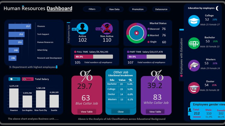
Week 6 Hr Dashboard
HR Dashboard Overview
Transform Data with Power Query
Saving your Project
Creating Name Multiple Ranges from Headers
Promotional Analysis
Creating the Dashboard Layout
Departmental Analysis
Gender Details Analysis
How to Update this Dashboard
Marital Status Analysis
Job Types Analysis
Transition Chart between Total Employees and Employees Salary
Cards for Educational Background
Display and Hide cards with Values
Educational and Gender Breakdown
Creating Gender Card
Integrating filters
Employees Promotional Analysis
Visualizing Promotional Analysis
Week 7 Migration insight Dashboard
Dashboard Overview
Creating Dashboard Layout
Using Normal Savings
Gender Analysis
Monthly Migration Analysis
Visa type by Immigration
Final and Provisional Analysis
Making Fancy Filters
Week 8 Order Analysis Dashboard
Complete Dashboard Overview
Dashboard Layout
Adding Values To Top Cards
KPI and Trend lines
Conditional messages and captions
Customizing Search Results
Making search dynamic with captions
Visualizing Search Results
Visualizing Search Results Messages
Show if any Filter is Selected
Matching the Slicers with the Background
Products Line Dashboard
Adding 3D images and values
Final Touches and Formatting
Week 9 Online store sales Dashboard
Dashboard Overview
Transforming Data and Splitting Columns in Power Query
Dashboard Environment
Time Rages Card
Creating Cards Types Visual Card
Analyzing Card Values
Visualizing Card Analyzed Values
Dynamic Custom Bar Chart for Card Types
Time Range Percentages Cards
Analyzing Time Rang
Best Selling Days
Selling Time Analysis Chart
Weekdays Analysis
Creating Best Selling Time Range
Formatting our Dashboard
Creating Top selling Location Base on the Filter Selected
Week 10 mobile phone Dashboard
Dashboard Overview
Data Transformation
Dashboard Area
Creating Generation Cards
Card Values and Percentages
Monthly Trendline
Dynamic Caption
Sub by Generation
All you need to master analytics
How to master this course
How to get better with this skill
How to get free dataset for practice
How to create your portfolio real one
How to Monetize your Analytics and Dashboard Skills
How to Monetize Excel Skill
How to Connect WhatsApp for Business to your Portfolio
How to Communicate with Clients if given an Offer
How to Transact with Clients that can’t speak and write in English
Is there a Big Opportunity for as an Excel Users
How to Receive Payment as a Freelancer
All you need to Master Excel Data Analytics
How to Master this Course
How to get Better with this Skill
How to get Free Dataset for Practice
How to Create your Analytics Portfolio Real
Bonus Dashboards
Bonus Dashboards For Inspirations
What is next
Taken the Next Step