Master Data Visualization with Python: A Complete Step-by-Step Guide to Unlocking the Power of Your Data
What you will learn
Introduction to Python for Data Visualization
Installing Required Libraries (Matplotlib, Seaborn, Plotly, etc.)
Basic Plotting: Line Plots, Scatter Plots, and Bar Charts
Customizing Plots: Titles, Labels, and Legends
Creating Subplots for Multiple Charts
Adding Annotations and Text to Plots
Saving and Exporting Charts for Different Formats
Customizing Aesthetics with Seaborn Themes and Styles
Creating Pair Plots, Heatmaps, and Violin Plots
Visualizing Relationships with Seaborn (Categorical, Linear, and Non-linear)
Creating Interactive Line, Bar, and Scatter Plots
Building Interactive Dashboards with Plotly Dash
Visualizing Time Series Data
Optimizing Performance for Large Data Visualizations
Principles of Effective Data Storytelling
Using Color Effectively in Data Visualizations
Why take this course?
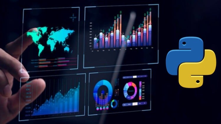
Unlock the power of your data with ‘The Ultimate Python Data Visualization Course- Step By Step.’ This comprehensive course is designed to take you from a beginner to an expert in Python data visualization. You’ll learn how to create stunning and informative visuals that communicate your data’s story effectively.
Starting with the basics, you’ll delve into Python’s powerful libraries like Matplotlib, Seaborn, and Plotly. Each section of the course builds on the previous one, ensuring a solid understanding of core concepts before moving on to more advanced techniques. You’ll work on real-world projects and practical examples that bring theory to life and equip you with skills you can apply immediately.
This Course Include:
Introduction to Data Visualization
- Introduction to Python for Data Visualization
- The Importance of Data Visualization and Typess
- Installing Required Libraries (Matplotlib, Seaborn, Plotly, etc.)
Getting Started with Matplotlib
- Basic Plotting: Line Plots, Scatter Plots, and Bar Charts
- Customizing Plots: Titles, Labels, and Legends
- Working with Colors, Markers, and Line Styles
- Creating Subplots for Multiple Charts
Advanced Matplotlib Techniques
- Customizing Plot Axes and Ticks
- Adding Annotations and Text to Plots
- Creating Histograms and Density Plots
- Working with 3D Plots in Matplotlib
- Saving and Exporting Charts for Different Formats
Data Visualization with Seaborn
- Creating Pair Plots, Heatmaps, and Violin Plots
- Customizing Aesthetics with Seaborn Themes and Styles
- Visualizing Relationships with Seaborn (Categorical, Linear, and Non-linear)
Interactive Visualizations with Plotly
- Creating Interactive Line, Bar, and Scatter Plots
- Visualizing Geospatial Data with Plotly
- Building Interactive Dashboards with Plotly Dash
Visualizing Data with Pandas and Other Libraries
- Using Pandas for Quick Data Visualization
- Visualizing Time Series Data
- Data Visualization with Altair and Bokeh
- Creating Interactive Visualizations with Altair
Visualizing Large Datasets
- Working with Big Data: Challenges and Strategies
- Visualizing Data with Dask and Vaex
- Optimizing Performance for Large Data Visualizations
Visual Storytelling and Design Principles
- Principles of Effective Data Storytelling
- Using Color Effectively in Data Visualizations
- Typography and Layout for Enhanced Clarity
Designed for data analysts, business professionals, and aspiring data scientists, this course provides the tools to make data-driven decisions with confidence. Unlock your data’s potential with this comprehensive, step-by-step guide and become a visualization expert.
Enroll now in this transformative journey and start making your data speak volumes!