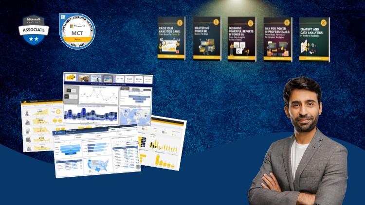
A Full Guide to Creating Insightful Reports, Interactive Dashboards, and Effective Data Storytelling Using Power BI
What you will learn
Design professional-quality reports in Power BI that are both visually appealing and easy to navigate.
Create interactive dashboards that allow users to explore data and gain insights dynamically.
Explore advanced Power BI features such as bookmarks, drill-throughs, and report tooltips to enhance report interactivity.
Implement themes and templates to ensure consistency across reports and align with organizational branding.
Use Power BI’s various visualization options to represent data effectively, including charts, maps, and custom visuals.
Become an expert in using Power BI to analyze and visualize numbers
Why take this course?
Based on the comprehensive outline you’ve provided for a Power BI reporting course, here are some additional tips and best practices for each module to enhance the learning experience and ensure the reports created are both functional and visually appealing:
Module 4: Donut & Column Charts
- When creating donut charts, ensure there is a clear differentiator between each data segment to maintain readability.
- For column charts, consider the order of the columns to represent categorical data in a meaningful way (e.g., chronological or importance).
Module 5: Selection Pane, Bookmarks, and Buttons
- Use the selection pane to declutter your report canvas by hiding visuals that are not currently in use.
- When creating bookmarks, be mindful of the visual sequence and transitions to guide users through the report smoothly.
- Design buttons with clear labels and icons to improve user experience and accessibility.
Module 6: Switching Visuals through Buttons
- Test different visualizations for the alternative states of your buttons to ensure they provide valuable comparisons or insights.
- Use parameter tables to allow users to select multiple items when switching between visuals.
Module 7: Layering, Grouping, and KPI Cards
- When layering visuals, consider the reading order and how it affects the narrative of your report.
- Group related visuals together to help users understand they are connected.
- KPI cards should be designed to stand out but not overpower other report elements. Use whitespace effectively around them.
Module 8: Chiclet Slicer and Dynamic Titles
- Chiclet slicers are great for mobile reporting as they provide a compact way for users to filter data.
- For dynamic titles, ensure that the DAX formulas used are both efficient and scalable to handle potential future dataset growth.
Module 9: Adding Logos, Slicers, and Finalizing Visuals
- Align your report’s visual design with your organization’s brand guidelines for consistency and professionalism.
- Ensure that logos or any other images are high resolution and appropriately sized to avoid pixelation.
Module 10: Conditional Formatting and Themes
- Use conditional formatting sparingly to highlight important data without causing distraction.
- Consistent themes can help in branding the report and making it easier for users to recognize reports from your organization.
Module 11: Dynamic Calculations
- Validate your DAX formulas with sample data to ensure they work as expected across various scenarios.
- Test the performance of your dynamic calculations, especially if dealing with large datasets, to avoid slow report load times.
Module 12: Dynamic Titles and Tooltips
- Customize tooltips to provide additional context or explanations without overwhelming the user with too much information.
- Ensure that dynamic titles reflect the most relevant data point or summary as the report is interacted with.
Module 13: Reset Button, Exporting, and Importing Themes
- A reset button should revert all visuals and filters back to a default state without causing confusion.
- When exporting and importing themes, document any customizations or considerations that may not be included in the theme files.
Module 14: Drill Throughs
- Design drill-through reports with a similar layout and style to the main report for consistency.
- Provide clear instructions on how to navigate between the initial view and the detailed views to avoid user confusion.
Throughout the course, encourage users to practice by building their own reports using sample datasets provided in Power BI or other data sources they are familiar with. This hands-on experience will solidify their understanding of the concepts and best practices covered in each module. Additionally, consider including case studies or real-world examples that demonstrate how these techniques can be applied effectively in different business scenarios.