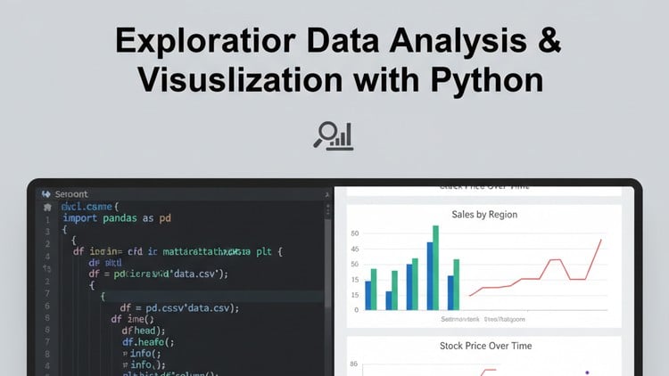
Master EDA & Data Visualization in Python: Cleaning, Statistical Analysis, Feature Engineering & Interactive Plots.
👥 5 students
Add-On Information:
“`html
Note➛ Make sure your 𝐔𝐝𝐞𝐦𝐲 cart has only this course you're going to enroll it now, Remove all other courses from the 𝐔𝐝𝐞𝐦𝐲 cart before Enrolling!
- Course Overview
- Embark on an intensive, hands-on journey with our ‘Exploratory Data Analysis & Visualization with Python’ course.
- Designed for just five students, this program offers unparalleled personalized instruction to transform raw data into actionable insights.
- Master Python’s powerful libraries to clean, analyze, and visualize complex datasets effectively.
- Develop a critical eye for data exploration and storytelling, gaining skills crucial for a data-driven career.
- Requirements / Prerequisites
- Foundational Python Knowledge: A basic understanding of Python syntax, data types, control flow, and function definitions is essential.
- Basic Statistical Concepts: Familiarity with fundamental statistical terms like mean, median, and variance will be highly beneficial.
- Equipped with Python Environment: Access to a laptop with Python 3.x, ideally via Anaconda and Jupyter Notebooks, is required.
- Enthusiasm for Data: Curiosity, problem-solving drive, and active participation are key for success in this immersive program.
- Skills Covered / Tools Used
- Mastery of Core Python Libraries for Data Science:
- Pandas for Data Manipulation: Proficiently load, clean, transform, and reshape diverse datasets using DataFrames; master indexing, filtering, merging, grouping, and time-series data.
- NumPy for Numerical Operations: Leverage NumPy’s powerful array capabilities for efficient numerical computations, critical for statistical analysis and foundational for other libraries.
- Matplotlib for Static Visualization: Create a wide array of high-quality static plots (scatter, line, bar, histogram, box), customizing every aspect for clarity and impact.
- Seaborn for Statistical Graphics: Elevate visualizations with Seaborn’s intuitive interface to generate aesthetically pleasing and statistically informative, complex multi-variable graphics.
- Plotly for Interactive Visualizations: Build dynamic, interactive dashboards and web-ready plots, enabling deeper data exploration through zooming, panning, and hover-tool functionalities.
- Comprehensive Data Cleaning & Preprocessing Techniques:
- Handling Missing Values: Strategically identify and address missing data using various imputation techniques or removal strategies, understanding their implications.
- Outlier Detection & Treatment: Employ statistical methods and visualization to identify and appropriately manage outliers, ensuring robust analyses.
- Data Type Conversion & Consistency: Master techniques to ensure data integrity by correctly managing data types and resolving inconsistencies across datasets.
- Applied Statistical Analysis for Deep Data Exploration:
- Interpreting Descriptive Statistics: Calculate and interpret key descriptive measures to summarize data distributions, central tendencies, and variability effectively.
- Exploring Data Distributions: Utilize histograms, Q-Q plots, KDEs, and statistical tests to assess the normality and underlying distribution of variables.
- Basic Inferential Concepts: Understand foundational concepts like correlation analysis and introduce basic hypothesis testing principles for exploratory insights.
- Practical Feature Engineering Methodologies:
- Deriving New Informative Features: Create powerful new variables from existing ones to enhance predictive power or reveal hidden relationships (e.g., date/time components).
- Binning & Discretization Strategies: Effectively transform continuous variables into discrete, categorical bins for simplified analysis or model input.
- Encoding Categorical Variables: Implement various encoding techniques (e.g., one-hot encoding, label encoding) to prepare categorical data for analytical models.
- Developing Effective Data Storytelling:
- Crafting Compelling Narratives: Learn to translate complex analytical findings into clear, concise, and persuasive data stories for diverse audiences.
- Principles of Dashboard Design: Understand best practices for designing intuitive and informative data dashboards that communicate key metrics effectively.
- Mastery of Core Python Libraries for Data Science:
- Benefits / Outcomes
- Proficient Data Explorer: Independently conduct thorough EDA, identifying patterns and gaining actionable insights.
- Master Data Visualization: Create impactful static and interactive visualizations for effective data storytelling.
- Enhanced Problem-Solving: Develop a systematic, data-driven approach to complex analytical challenges.
- Strong Portfolio Foundation: Hands-on projects provide excellent material for a compelling data science portfolio.
- Boost Career Prospects: Acquire highly sought-after skills for roles in data science, analytics, and business intelligence.
- Personalized Learning: Benefit from the intimate class size (5 students) for tailored feedback and direct instructor interaction.
- PROS
- Exclusive Small Class Size: Guarantees highly personalized attention and tailored learning.
- Intensive Hands-On Practice: Focuses on real-world datasets for tangible, industry-relevant skills.
- Comprehensive Skill Set: Covers the full EDA spectrum: cleaning, stats, visualization, feature engineering.
- Interactive Learning Environment: Fosters collaborative problem-solving and in-depth discussions.
- Direct Instructor Accessibility: Frequent access for questions, feedback, and conceptual clarification.
- CONS
- Requires Consistent Engagement: The intensive nature demands sustained effort and independent practice to fully grasp all concepts.
“`
Learning Tracks: English,IT & Software,Other IT & Software
Found It Free? Share It Fast!