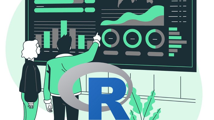
How to visualize data in R, understand ggplot2 package, data visualization tools in R, and project on Covid-19 analysis.
What you will learn
Deep understanding of data visualization in R
Project on Data Visualization – Analyzing & Visualizing Covid-19
What is data visualization and selecting the right chart type
Importance of data visualization & and its benefits
Applications of data visualization
R programs for scatterplot, histogram, bar & stacked bar chart, boxplot, heatmap, line chart, density plot, pie chart
Data Visualisation with ggplot2 package
What is ggplot2, plotting with ggplot2, building your plots iteratively
Univariate distributions & bar plot, annotation with ggplot2, axis manipulation, density plot
More data visualization tools in R, text mining and word cloud
Radar chart, waffle chart, area chart, correlogram
Why take this course?
📊 Unlock the Power of Data with Data Visualization in R! 🚀
Welcome to the Data Visualization with R course by Uplatz – your gateway to mastering data storytelling through the power of R and ggplot2! 🌐
What’s Inside the Course?
Understanding Data Visualization:
Data visualization is more than just a fancy graph; it’s a critical skill in data science that allows us to turn numbers into compelling stories. This course will guide you through the art of representing data visually to make complex data more accessible, understandable, and useful.
The World of R:
R stands out as a statistical programming language, with powerful tools designed for data analysis and visualization. Beyond its robust statistical capabilities, R’s graphics systems provide an environment that can take your data insights from raw numbers to rich visual narratives.
ggplot2: The Graphics Superhero:
Dive into the world of ggplot2, a part of the tidyverse ecosystem, and learn how it simplifies the process of creating sophisticated data visualizations with minimal effort. With ggplot2, you’ll discover how to customize and design plots that are both informative and visually appealing.
Course Objectives:
- 🎯 Understand the importance of data visualization and its role in effectively communicating your findings.
- 📈 Get a quick introduction to base R graphics to lay the groundwork for your visualization journey.
- 🕵️♂️ Explore different plot types in R to select the most appropriate representation for your data.
- 🧩 Utilize advanced data visualization tools in R to create impactful and insightful plots.
- 🛠 Learn how to design and implement a visualization from scratch, tailored to your dataset.
- 🤔 Grasp the science of perception and apply design principles to enhance the clarity of your visualizations.
- 📚 Distinguish between exploratory graphics for data analysis and explanatory graphics for publication.
- ✨ Master advanced plot customization techniques to elevate your visualizations beyond the basics.
Course Syllabus:
1. Data Visualization in R:
- What is data visualization and why does it matter?
- Selecting the right chart type for your data.
- The importance of data visualization and its benefits.
- Real-world applications of data visualization.
- Hands-on practice with various types of plots in R.
2. Data Visualization with ggplot2 Package:
- Introduction to the ggplot2 package.
- Step-by-step guide on plotting with ggplot2.
- Building your plots iteratively for a more intuitive approach.
- Annotating and manipulating axes for precision and detail.
- Exploring univariate distributions, bar plots, and density plots using ggplot2.
3. More Data Visualization Tools in R:
- Text mining and creating engaging word clouds.
- Constructing radar and waffle charts to highlight categorical data.
- Using area charts for time series data.
- Identifying relationships with correlograms.
Project on Data Visualization – “Visualizing Covid-19”:
Embark on a comprehensive project where you’ll create from scratch a visualization of Covid-19 data, uncovering trends and patterns that tell the story behind the numbers. This project will be your capstone, showcasing all the skills you’ve acquired throughout the course.
Why Should You Take This Course?
This course is designed for individuals who want to enhance their data analysis skill set with visual storytelling capabilities. Whether you’re a student, a professional in the tech industry, or someone who just loves data – this course will provide you with the tools and knowledge to:
- Communicate complex data findings in an accessible manner.
- Make data-driven decisions with confidence.
- Stand out in your field by presenting data insights that are not only accurate but also visually compelling.
Enroll now and start your journey towards becoming a data visualization expert with R and ggplot2! 🌟
Note: This course description assumes prior knowledge of R programming or a willingness to learn the basics alongside the course content. If you’re new to R, consider brushing up on the fundamentals before diving into this advanced visualization course. Let’s turn data into impact together! 🔢✨