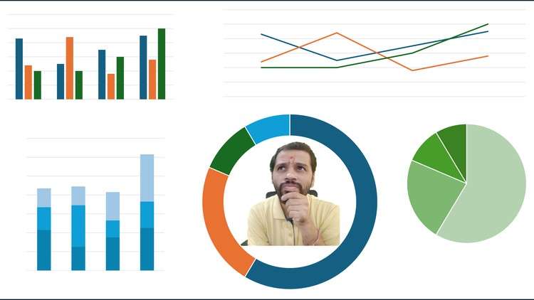
From confusion to clarity in deciding which chart to use
What you will learn
Identify the key factors that influence the choice of the most appropriate graph for visualizing data.
Understand the characteristics and limitations of common graph types
Apply practical decision-making frameworks to confidently select the optimal graph
Thinking skills to evaluate the effectiveness of existing data visualizations
Why take this course?
Feeling lost in a sea of bar charts and pie graphs? Struggling to choose the right visual to tell your data’s story?
This course is your compass. From confusion to clarity – this course is designed to assist you to decide when to use which graph while designing your dashboard. Dive deep into the science and art of choosing the perfect graph for every scenario. Learn to master the nuances of common graph types, from bar charts to funnel charts, understanding their strengths and limitations. become a critical thinker! Learn to evaluate existing data visualizations, identify misleading presentations, and suggest alternative representations. Sharpen your skills to communicate your data with clarity and impact.
As a presenter, i had a made a mistake of just adding the graph based on how it looks and fits in my PPT instead knowing the science behind the same. This course helps you to decode the mistake and arrive at solution. This course cracks the code of effective visualization, helping you ditch the “eye-candy” approach and understand the science of selecting the perfect graph for every story in just 22 minutes. Learn to decode misleading visuals and craft impactful presentations that truly resonate with your audience.