Crash course for those who want to make a single page website using Twitter Bootstrap 4 within 2 hours.
What you will learn
Rapid prototyping of websites
Ability to understand how to make use of Bootstrap to design websites
Why take this course?
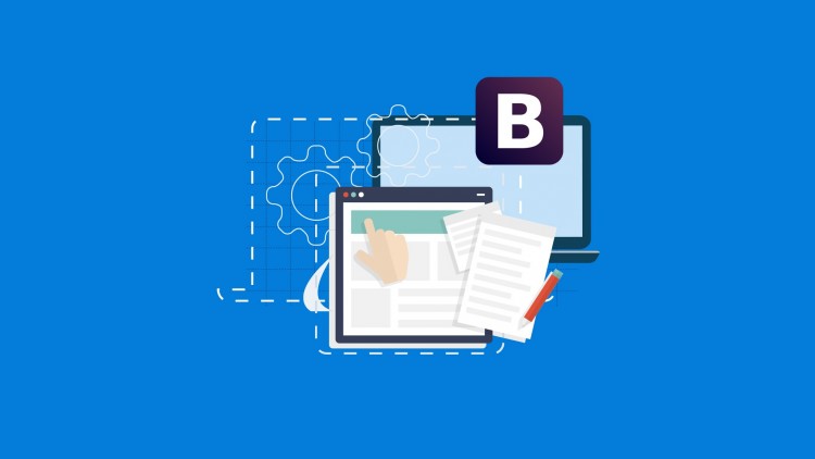
In this crash course we are going to learn how to build a responsive single page website using Twitter bootstrap 4. This course is initially done with Bootstrap 3.x but now updated to Bootstrap 4.0. Existing students get free update! I’m commited to update the same in the future too.
I’m a fan of learn as you go approach. There is no point learning everything, unless you know how to apply it practically. In this course I’m going to help you to build up some core skills as web designer with minimal effort.
Beside Twitter bootstrap, I’ll teach you how to make use of Google Web fonts and some interesting CSS3 features.
By end of this tutorial, not only you will have a responsive single page site but also a template that you can re-design and re-sell to your potential clients. Also, you will know how many designers and developers do rapid development using Twitter bootstrap.
See you in next lesson.
- Course Overview
- Experience a high-intensity, project-driven learning path designed to transition students from basic coding to professional-level Front-End Development.
- Understand the architectural philosophy behind Single Page Applications (SPA), which are increasingly favored for modern landing pages, resumes, and business portfolios.
- Deconstruct the fundamental Bootstrap 4 Framework to see how pre-defined classes can replace hundreds of lines of manual CSS, speeding up your workflow significantly.
- Follow a logical, step-by-step construction process that begins with setting up a clean development environment and ends with a polished, interactive web presence.
- Explore how to effectively leverage JavaScript-based components within the framework to add dynamic behavior such as smooth scrolling and interactive menus without deep scripting knowledge.
- Requirements / Prerequisites
- A foundational knowledge of HTML5 document structures, including tags, attributes, and element nesting, is essential for following the layout process.
- Basic familiarity with CSS3 concepts such as the box model, color hex codes, and font styling will help you customize the final look of your website.
- A functional computer with a code editor like Visual Studio Code, Sublime Text, or Atom already installed to facilitate real-time coding practice.
- An active internet connection to link your project to the Bootstrap CDN and other external resource libraries like Google Fonts.
- Skills Covered / Tools Used
- Responsive Grid System: Master the use of containers, rows, and multi-size columns to create a website that looks perfect on desktops, tablets, and mobile phones.
- Navigation Engineering: Build a responsive Navbar with dropdown menus and sticky positioning that remains accessible as the user scrolls.
- UI Components: Implement high-conversion elements including Jumbotrons for hero sections, Cards for service descriptions, and Modals for pop-up information.
- Typography and Iconography: Integrate FontAwesome icons and custom web fonts to provide a professional, modern aesthetic to your text content.
- Utility Classes: Learn to use spacing utilities (margin and padding), text alignment, and background colors to fine-tune your design without leaving the HTML file.
- Browser DevTools: Utilize built-in browser tools to inspect elements, debug layout issues, and simulate different mobile device viewports.
- Benefits / Outcomes
- Complete a fully functional, Production-Ready Website that you can host on the web and add to your personal developer portfolio immediately.
- Gain a competitive edge in the job market by mastering Responsive Web Design techniques that are mandatory in today’s mobile-first digital landscape.
- Develop a reusable Custom Template that serves as a blueprint for future client projects, drastically reducing your development time and overhead.
- Bridge the gap between design theory and technical execution, allowing you to translate visual mockups into live, clickable interfaces with precision.
- Build the confidence necessary to take on Freelance Web Design gigs by delivering high-quality sites in a fraction of the time compared to traditional methods.
- PROS
- Designed for maximum Time-Efficiency, ensuring you gain usable skills in under two hours without unnecessary academic fluff.
- The Project-Based Learning approach ensures that you aren’t just memorizing syntax but actually building something tangible and useful.
- Focuses on the most stable and widely supported version of the framework, ensuring your site works across all modern web browsers.
- Perfectly suited for visual learners who prefer seeing immediate results on the screen as they type each line of code.
- CONS
- The course focuses strictly on Bootstrap 4; while the concepts are universal, students will need to eventually learn the minor syntax updates found in version 5 and beyond.