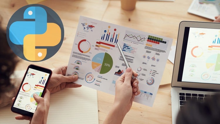
Transforming Data into Insights: A Comprehensive Guide to Python-based Data Visualization
⏱️ Length: 3.7 total hours
⭐ 4.49/5 rating
👥 57,882 students
🔄 January 2024 update
Add-On Information:
Note➛ Make sure your 𝐔𝐝𝐞𝐦𝐲 cart has only this course you're going to enroll it now, Remove all other courses from the 𝐔𝐝𝐞𝐦𝐲 cart before Enrolling!
- Course Overview
- Dive into the transformative world of data visualization using Python, moving beyond simple charts to craft compelling visual stories.
- Bridge the gap between raw datasets and actionable insights by mastering the art and science of graphical representation.
- Learn to identify hidden patterns, trends, and outliers that are often obscured in tabular data, empowering data-driven decision-making.
- This masterclass systematically guides you from foundational principles to advanced plotting techniques, ensuring a holistic understanding of the visualization lifecycle.
- Explore a comprehensive framework for selecting the most appropriate visualization type for diverse datasets and audience types.
- Transform complex analytical findings into intuitive, engaging, and easy-to-understand visual narratives that resonate with any stakeholder.
- Uncover the power of visual communication to make your data speak volumes, enhancing your ability to influence and inform.
- Designed for those eager to unlock the full potential of their data, this course will equip you with the practical skills to excel as a data storyteller.
- Requirements / Prerequisites
- A fundamental grasp of Python programming is recommended, including familiarity with basic syntax, common data structures (lists, dictionaries), and function usage.
- Prior exposure to data manipulation concepts, particularly working with Pandas DataFrames, will be highly beneficial but not strictly mandatory.
- No previous experience with dedicated data visualization libraries or complex design principles is necessary; the course provides a comprehensive foundation.
- Access to a computer with an internet connection is required for downloading and installing Python (e.g., via Anaconda distribution) and all course-specific libraries.
- An analytical mindset and an eagerness to experiment with data to uncover its latent visual potential are highly encouraged.
- Basic problem-solving skills to interpret data questions and translate them into visual queries will aid your learning journey.
- Willingness to actively engage with coding exercises and apply learned concepts to diverse real-world datasets is key to mastery.
- Skills Covered / Tools Used
- Advanced Matplotlib Customization: Go beyond basic plotting to fine-tune every aesthetic detail of your charts, including custom annotations, multi-panel subplot layouts, and complex figure arrangements.
- Statistical Plotting with Seaborn: Master specialized statistical visualizations such as distribution plots (histograms, kernel density estimates), relational plots (scatter and line plots with statistical estimators), and categorical plots (box plots, violin plots, bar plots for grouped data).
- Data Preparation for Visualization: Understand crucial data cleaning, transformation, and aggregation techniques using Pandas to optimize datasets for clear, accurate, and impactful visual representation.
- Effective Color Palette Selection: Learn strategies for choosing appropriate and accessible color schemes to enhance readability, highlight key features, and ensure universal understanding of your visualizations.
- Interactive Visualization Principles (Conceptual): Gain a conceptual understanding of how interactive elements can elevate data exploration, setting a strong foundation for future engagement with interactive tools.
- Dashboard Component Creation: Develop the ability to build individual, high-impact visual components that can be seamlessly integrated into larger dashboards and reporting frameworks.
- Exporting and Sharing Visualizations: Discover best practices for saving your plots in various high-quality formats (e.g., PNG, SVG, PDF) suitable for professional presentations, reports, and web integration.
- Error Handling in Visualization Workflows: Identify common pitfalls and learn effective debugging strategies for visualization code, ensuring robust and reliable plot generation.
- Python Libraries: Extensive practical application of Pandas for robust data manipulation, Matplotlib for foundational and highly customizable plotting, and Seaborn for sophisticated statistical graphics.
- Benefits / Outcomes
- Elevate Your Data Storytelling: Transform raw data into compelling narratives that resonate with diverse audiences, making your insights unforgettable and actionable.
- Boost Your Analytical Prowess: Develop a keen eye for identifying intricate trends, critical outliers, and subtle patterns in data through visual exploration, significantly enhancing your problem-solving capabilities.
- Enhance Communication Skills: Effectively convey complex findings to both technical and non-technical stakeholders using clear, impactful, and aesthetically pleasing visualizations that drive understanding.
- Expand Your Data Science Toolkit: Add industry-standard Python visualization libraries to your professional arsenal, becoming a more versatile and highly sought-after data professional.
- Create Professional-Grade Visuals: Produce publication-quality charts and graphs suitable for academic papers, comprehensive business reports, dynamic dashboards, and impressive online portfolios.
- Drive Better Decision-Making: Empower yourself and your team to make informed, strategic choices by presenting data in a format that promotes immediate understanding and actionable insights.
- Build a Strong Portfolio: Generate a diverse collection of sophisticated and impactful visualizations from practical exercises, showcasing your expertise to potential employers or clients.
- Master Visual Debugging: Quickly identify issues, validate hypotheses, and accelerate your data analysis workflow by leveraging visual inspection of your datasets and models.
- PROS
- Practical, Hands-On Approach: Emphasis on coding exercises and real-world examples ensures immediate application of learned concepts, fostering practical skill development.
- Industry-Relevant Libraries: Focus on Matplotlib and Seaborn equips learners with highly demanded skills for data visualization roles in the industry.
- Clear and Concise Instruction: The course structure is designed for efficient learning, breaking down complex topics into manageable, easy-to-understand modules.
- Comprehensive Skill Building: Covers not just plotting, but also data preparation and communication strategies, offering a holistic view of the visualization process.
- Accessible for Learners: Caters to those with foundational Python knowledge, providing a structured path to master data visualization without requiring prior design experience.
- CONS
- May not extensively cover highly specialized or cutting-edge interactive visualization libraries like Plotly or Bokeh, focusing primarily on Matplotlib and Seaborn for a deep dive.
Learning Tracks: English,Development,Data Science
Found It Free? Share It Fast!