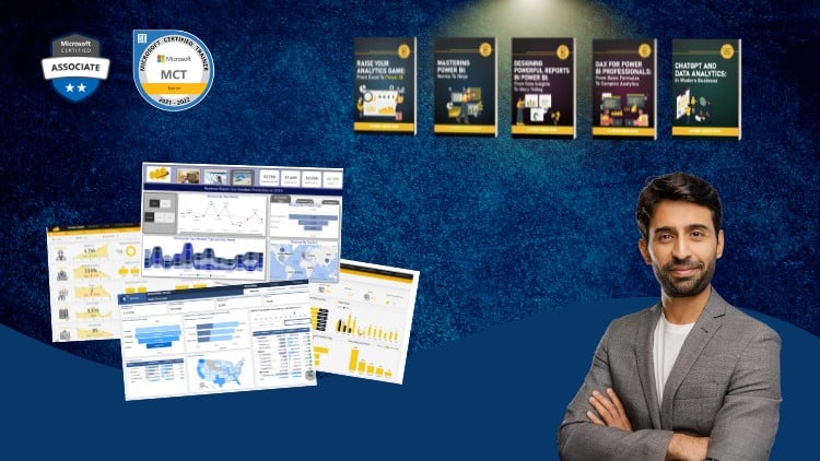
A Full Guide to Creating Insightful Reports, Interactive Dashboards, and Effective Data Storytelling Using Power BI
⏱️ Length: 3.6 total hours
⭐ 4.54/5 rating
👥 30,779 students
🔄 November 2025 update
Add-On Information:
Note➛ Make sure your 𝐔𝐝𝐞𝐦𝐲 cart has only this course you're going to enroll it now, Remove all other courses from the 𝐔𝐝𝐞𝐦𝐲 cart before Enrolling!
- Course Overview
- This comprehensive program, “Mastering Power BI Report Design – Beginner to Advanced,” is meticulously crafted to transform participants from novice users into proficient report designers within Microsoft Power BI. Spanning a concise 3.6 hours, this course has garnered significant acclaim with a 4.54/5 rating from over 30,000 students, indicating its effectiveness and popularity. The recent November 2025 update ensures the content remains current with the latest Power BI functionalities and design best practices. The overarching goal is to equip learners with the ability to transform raw data into compelling visual narratives that drive informed decision-making.
- The course embarks on a structured learning journey, beginning with foundational concepts essential for any beginner and progressively delving into sophisticated techniques that empower advanced users. It moves beyond mere data visualization to encompass the art of effective data communication, enabling the creation of reports and dashboards that are not only aesthetically pleasing but also functionally intuitive and insightful. The emphasis is on building reports that tell a story, guiding the user through complex datasets with clarity and purpose.
- Participants will acquire a holistic understanding of the Power BI ecosystem, focusing on the report creation aspect. This includes mastering the interface, understanding data modeling principles relevant to report design, and applying a range of visualization tools to communicate data effectively. The curriculum is designed to foster a deep appreciation for user experience and the principles of good visual design as applied to business intelligence.
- The course is presented as a full guide, suggesting an all-encompassing approach to report design. This implies that every critical aspect, from initial report conception to the final polished output, will be addressed. The caption, “Creating Insightful Reports, Interactive Dashboards, and Effective Data Storytelling Using Power BI,” succinctly summarizes the three core pillars of the learning experience: generating meaningful insights, building dynamic user interactions, and communicating findings through compelling narratives.
- Requirements / Prerequisites
- A foundational understanding of basic computer literacy and navigation is assumed.
- Familiarity with Microsoft Windows operating system and common file management practices.
- No prior experience with Power BI or data visualization tools is strictly required, making it accessible to absolute beginners.
- Access to a computer capable of running Power BI Desktop (minimum system requirements should be checked against Microsoft’s official documentation).
- A willingness to learn and experiment with data and design elements.
- Skills Covered / Tools Used
- Power BI Desktop: This is the primary tool used throughout the course for report and dashboard creation. Learners will become adept at utilizing its various panes, features, and functionalities.
- Data Visualization Principles: Beyond just knowing which chart to use, the course will impart principles of effective visual representation, including choosing the right chart type for the data and audience, and avoiding common pitfalls.
- User Interface (UI) and User Experience (UX) Design for Reports: Understanding how to structure reports for optimal navigation and ease of comprehension, ensuring a smooth user journey through the data.
- Layout and Formatting: Mastering the arrangement of visuals, text, and shapes on a report canvas to create a coherent and professional aesthetic.
- Color Theory and Typography: Applying principles of color usage and font selection to enhance readability, draw attention to key insights, and maintain brand consistency.
- Report Interactivity Techniques (beyond basic drill-through/bookmarks): Exploring how to create sophisticated user interactions that allow for deep data exploration and dynamic analysis without overwhelming the user.
- Data Storytelling Frameworks: Learning how to structure reports to guide an audience through a narrative, revealing trends, patterns, and conclusions in a logical and impactful sequence.
- Performance Optimization for Reports: Understanding how to design reports that load quickly and respond efficiently, even with large datasets.
- Incorporating Interactive Elements: Techniques for adding buttons, slicers, and other interactive components that empower end-users to filter and manipulate data for personalized analysis.
- Benefits / Outcomes
- Participants will gain the confidence to independently design and deploy professional, user-friendly Power BI reports.
- They will be able to translate complex business questions into clear, actionable data visualizations.
- Graduates will possess the skills to enhance data accessibility and foster a more data-driven culture within their organizations.
- The ability to create compelling data narratives will empower them to present findings persuasively and influence decision-making.
- Learners will be equipped to build dynamic dashboards that facilitate self-service BI for end-users.
- The course will cultivate a strategic approach to report design, prioritizing clarity, impact, and user engagement.
- Upon completion, individuals will be well-positioned to contribute significantly to business intelligence initiatives and potentially advance their careers in data analytics and reporting roles.
- A refined aesthetic sense for data visualization, leading to reports that are not only informative but also visually appealing and memorable.
- PROS
- Extensive Student Base & High Rating: A large community and strong satisfaction scores indicate a proven track record of delivering valuable content.
- Up-to-Date Content: The November 2025 update suggests the course incorporates the latest Power BI features and best practices.
- Comprehensive Scope: Covers beginner to advanced concepts, offering a complete learning path for aspiring Power BI report designers.
- Focus on “Storytelling”: Emphasizes the crucial aspect of narrative in data presentation, which is often overlooked.
- CONS
- Time Commitment: While 3.6 hours is relatively short, mastering advanced concepts may require significant practice beyond the course duration.
Learning Tracks: English,Office Productivity,Microsoft
Found It Free? Share It Fast!